UX research & audits
Stakeholder and user interviews, analytics review and heuristic audits that show where users struggle, and why.
We research, design and test the screens behind websites, mobile apps and SaaS products — so customers find what they need, finish what they started, and come back.
(01) Overview
Good design isn’t decoration. It’s the difference between a sign-up form people finish and one they abandon, between a dashboard that answers questions and one that creates them.
Because we also build what we design, our work is grounded in how products really behave — real data, loading and error states, small screens and slow networks — not just the happy path in a presentation.
You get designs your developers, or ours, can implement exactly, plus a design system that keeps every future screen consistent as the product grows.
(02) What we build
Take the full process or just the part you need — from a one-week UX audit to a complete product design.
Stakeholder and user interviews, analytics review and heuristic audits that show where users struggle, and why.
Sitemaps, navigation and content structures that make large websites and complex products easy to find your way around.
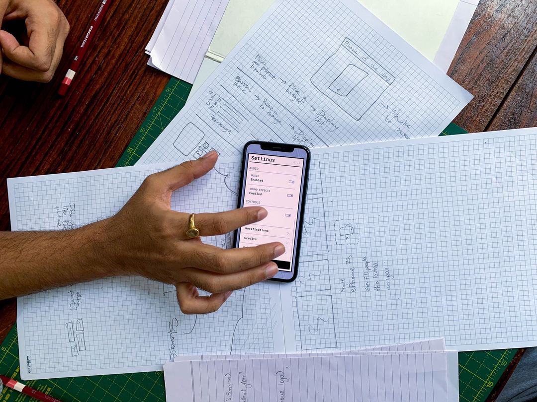
Low-fidelity layouts and end-to-end flows to agree structure and logic before any visual design.
High-fidelity visual design for web and mobile, rooted in your brand and built for accessibility from the start.
Clickable prototypes for usability testing, investor demos and stakeholder sign-off.
Reusable components, tokens and usage guidelines that keep products consistent and speed up development.
Moderated and unmoderated tests with real users, turned into a prioritised list of fixes.
Modernising dated apps and dashboards without disrupting the people who rely on them every day.
(03) How it works
Every design decision traces back to a user need or a business goal we agreed at the start.
Goals, users, competitors and constraints. We review analytics and speak to users wherever possible.
User flows, information architecture and wireframes for the journeys that matter most.
Visual design, interaction details and a clickable prototype of the key flows.
Usability testing and refinements, then developer-ready files and a documented design system.
(04) Technology
Shared, live design files mean you can comment on work in progress at any time — no waiting for a big reveal.
(05) Who it’s for
We design for customer-facing products and the internal tools that teams live in all day.
Onboarding, dashboards and settings that cut support tickets and help trials convert.
Native-feeling iOS and Android interfaces with thumb-friendly layouts and clear feedback.
Product discovery, product pages and checkouts designed to lift conversion.
Dense, data-heavy screens made calm and fast for expert daily users.
Patient and clinician experiences that are clear, careful and accessible.
Learning and administration flows for students, parents and staff.
(07) Buyer’s guide
Design quality is measurable. These are the principles we hold our own work to.
Define the jobs users must complete — book, buy, apply, find — and measure whether they can. Debates about colour matter far less than a checkout people actually finish.
Many users are on budget Android phones, patchy networks and, sometimes, a second language. Plain microcopy, generous tap targets, lightweight screens and support for regional-language content often matter more than any visual trend.
Readable contrast, keyboard support and clear labels help everyone, including older users and people with disabilities — and enterprise and government buyers increasingly expect them.
Once components and rules are defined, new screens are faster to design and build, and the product stays consistent as your team grows.
(08) Related guides
Practical guides from our team on budgets, technology choices and planning, updated for 2027.

Startups6 min read
How to cut an idea down to a first version people will actually use, what that costs in India, and the mistakes that burn a seed round.

Process6 min read
Every stage of a professional build, from the first call to the weeks after launch, with realistic timings and what you will be asked for at each step.
(09) FAQ
UX (user experience) design is about structure and behaviour — what users need, the steps they take and how the product responds. UI (user interface) design is the visual layer — layout, typography, colour and components. Good products need both, and we do both.
It depends on the number of screens and flows, how much research is needed, and whether you need a full design system. We scope each phase and quote a fixed price, so you know the cost before work starts.
Both. We can hand off developer-ready files to your in-house team, or build the product ourselves — which means the design is always feasible and implemented faithfully.
We design in Figma, with shared files you can view and comment on at any time, and hand off through Figma Dev Mode with design tokens and component documentation.
Yes. We start with an audit of the current experience and your analytics, keep what works, and roll out improvements carefully so existing users aren’t disrupted.
Yes. We run usability tests on prototypes with people who match your audience, then prioritise the changes that will have the most impact.